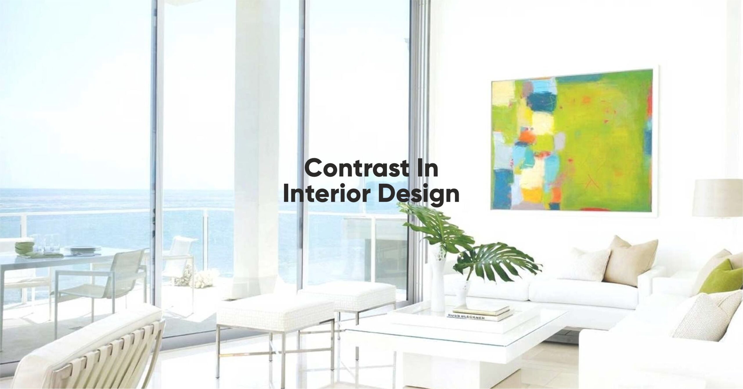
Contrast is a fundamental principle in Interior Design, serving as a powerful tool for creating visually stunning spaces. By skillfully combining different elements, contrast adds depth, interest, and personality to a room, resulting in a captivating and visually stimulating environment. In this blog, we will explore the significance of contrast in interior design and its profound impact on our overall well-being and subconscious.
Discover how contrast shapes the aesthetics of interior spaces, elevating their appeal and creating a dynamic atmosphere that leaves a lasting impression.
Contrast matters in interior design because it helps create balance and harmony within a space. By introducing contrasting elements, we can create focal points and draw attention to specific areas, objects, or architectural features.
This intentional contrast helps break the monotony and creates a sense of dynamism and energy within the room. It engages our senses and stimulates our minds, enhancing the overall experience of the space.
So,
How Do We Create Contrast in Interior Design? Let's Delve into a Few Effective Strategies
Bright & Dull

Pairing bright and dull elements can create a captivating contrast. For example, combining vibrant accent pillows with a neutral-colored sofa or placing a glossy vase against a matte backdrop can add depth and visual interest to a room.
Organic & Geometric
Contrast can be achieved by blending organic shapes with geometric patterns. The flowing curves of a chair against a backdrop of linear tiles or the combination of a round mirror on a wall adorned with rectangular artworks can create a captivating visual interplay.
Feminine & Masculine
Blending feminine and masculine elements can bring balance and harmony to a space. Soft, floral patterns can be contrasted with bold, angular furniture or delicate curtains can be paired with a sturdy, leather armchair, adding depth and character to the overall design.
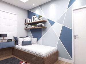
Round vs Square
Contrasting round and square shapes can create a visually appealing contrast. Placing a circular dining table against rectangular cabinets or positioning a square area rug beneath a round coffee table can add a touch of drama and visual interest.
Now that we know how to create contrast, let's explore,
How to Choose the Right Contrasts for Your Space
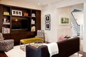
Color Contrast
Utilizing contrasting colors is an effective way to create visual impact. Pairing complementary colors, such as blue and orange or purple and yellow, can create a vibrant and energetic atmosphere. On the other hand, contrasting warm and cool tones, like red and blue, can evoke a sense of balance and harmony.
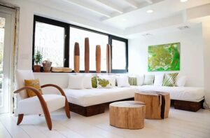
Texture
Contrasting textures can add depth and tactile interest to a room. Combining smooth and rough surfaces, such as a plush velvet sofa against a brick accent wall, or a sleek glass table on a textured rug, creates a captivating interplay of sensations.
Material
The contrast in materials can bring a sense of richness and variety. Mixing wood with metal, glass with fabric, or concrete with plush upholstery can create a visually compelling and balanced composition.
Shape & Form
Contrasting shapes and forms can create a sense of visual tension. Pairing curvilinear furniture with angular architectural details, or combining organic-shaped accessories with structured elements, can add an exciting dynamic to a space.
Contrast can be used in various ways to enhance the design of a room.
Here Are a Few Examples
Light vs Dark Colors

Contrasting light and dark colors can create a dramatic effect. A light-colored wall adorned with a dark painting or a dark accent wall against a room filled with light furniture can add depth and intrigue.
Smooth vs Rough Textures
Contrasting smooth and rough textures can create a tactile experience. Placing a rough-hewn wooden table alongside smooth leather chairs or combining a sleek marble countertop with a textured backsplash can add richness and variety.
High Gloss vs Matte Finish
Contrasting high gloss and matte finishes can create a visual impact. Pairing glossy cabinets with a matte-finished countertop or combining a matte-painted wall with glossy accessories can create an interesting play of light and reflection.
Positive vs Negative Spaces
Contrast can also be achieved by balancing positive and negative spaces. Placing a bold piece of furniture in an otherwise minimalistic room or creating an accent wall in a predominantly white space can create a focal point and add drama.
Conclusion:
The impact of contrast in Interior design extends beyond aesthetics. It has the power to influence our mood, well-being, subconsciousness, and the overall aura of a space. By skillfully incorporating contrast, we can create environments that evoke specific emotions, promote a sense of balance and harmony, and stimulate our senses.
The deliberate play of contrasting elements enhances the energy and atmosphere of a room, leaving a lasting impression on its occupants. Embracing contrast in Design is a transformative way to create spaces that are not only visually striking but also deeply impactful on our overall experience.